
Hockey cards rule. Who didn’t love the feeling of tearing the waxy wrapping off a brand new pack of cards? Trying to peel the gum off that Russian card without ruining it was part of the fun.
The early 90’s were the glory years for hockey cards—they were affordable, they were awesome, and they were everywhere. What really made these cards great was how simple, yet exciting, they were. With the exception of O-Pee-Chee’s Red Army mini-set (there was one Russian card per pack) and Upper Deck’s poorly made five card hologram set (the red blur was Yzerman, the grayish blur was Gretzky), there were no inserts. That meant that if you bought a full case of packs, you had a pretty good chance of putting together the full set—goons, bums, geezers and all. They didn’t have autographed platinum-die-cut-game-worn-jersey cards, they had blurry, off-centered cards that were totally awesome.
Unfortunately for some, these cards haven’t appreciated in value much in the 16 years since they first came out. I guess since every kid in

O-Pee-Chee 90-91
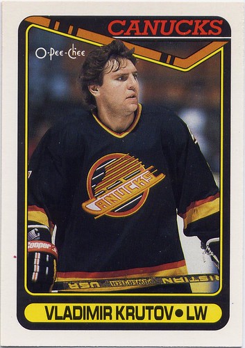
O-Pee-Chee had the advantage of being the only hockey card company for about thirty years leading up to the 90’s. They pretty consistently put out awesome sets, and the 90-91 set was no exception. With 528 cards, O-Pee-Chee covers every player you remember and many more that you don’t. They even managed to squeeze in all the players from the two Russian clubs that played against NHL teams in the 89-90 season. Although you could complain that this set focused too much on close-up shots of the players and not enough on action, the classic design with the hockey stick and team colours on the front and the simple two colour backs makes this one of my favorite sets of all-time.
Five of my favorites:
#190 - Winnipeg Jets - I’m a sucker for horizontal cards. I like switching from full screen to wide screen for those exciting action shots. Goalies and the older Jets logo are two other things I like. There are too many good things about this card to mention them all.
#69 – Neely - Cam Neely is a badass. He rules while taking a slapshot, and ruled as Sea Bass in the movie Dumb & Dumber
#501 – Arturs Irbe - It looks like Irbe's pads were orange at some point but got covered in tar. Bonus points for spelling his name wrong.
#42 - Alexander Mogilny - He looks like one of those really awkward, greasy kids from high school that would play magic cards in the science room at lunch.
#308 -

Score 90-91
It’s hard to say for sure, but I think that this Score set was my favorite as a kid. The cards weren’t dirt cheap like Pro-Set, but they weren’t totally out of range like Upper Deck, and they had way more action than any other set. When you’re a kid, you don’t want close-ups of guys sitting on the bench, you want guys blasting slapshots. Score has lots of that.
Score’s design is simple but great: the team, a couple of red and blue stripes, and a little silhouette that is supposed to help you understand what position they play (but doesn’t) is all you need. The rest of the card is filled with some of the best photography you’ll see in an early 90’s set. Score doesn’t have all the bums and Russians that O-Pee-Chee has, but they make up for with some sweet draft pick and all-star team cards.
Five of my favorites:
#1 – Wayne Gretzky – Score starts the set off right with the best Gretzky card of the year.
#300 – Brett Hull – There are more horizontal cards in this set than any other set I’ve seen. This is probably the best. Nice photo of
#218 – Zarley Zalapski - I’ve always loved this card—not because he has a funny name, or because this card is horizontal when it doesn’t really need to be, but because Pittsburgh had such a great home jersey that year.
#304 – Mark Tinordi - This guy is just trying to go out there and really set the tone.
#68 – Mike Liut - Rules.
Upper Deck 90-91
I like all the 90-91 sets. There’s something awesome about every single one, but Upper Deck is the crème de la crème of 90-91 hockey cards.
These were the cards I always wanted but could never afford. Upper Deck was the first company to put that fine glossy finish on the cards that made them look so vibrant and exciting. The first series of the Upper Deck 90-91 has just 400 cards, the fewest of the major sets that year, but they make the most of it. It’s hard to find a single card that won’t make you so stoked that you’ll wish it was 1990 all over again.
Score is the only other card to have photography anywhere near as cool as Upper Deck’s. I really can’t decide which one I like better: Score has more horizontal action shots, while Upper Deck has cooler angles and lenses. This set also features the most bizarre team checklists you will ever see.
Five of my favorites:
#10 – Rick Wamsley – Glove saves make for great cards.
#46 – Mike Modano - Look at the guy in the background. He’s stoked.
#302 – Vancouver Canucks Checklist – These checklist paintings are so bad. I don’t know if the artist was trying to make Petri Skriko look androgynous, but at least he’s not in space.
#135 – Bruce Hoffort – This was one of my favorite cards as a kid. I got a trivia question about Philadelphia goalies at the Hockey Hall of Fame correct because of this card. Boo-Yah!
#95 – John Tonelli – Goal! The back of this card has a nice shot of the seats in the old North Stars arena.

Pro-Set 90-91
Pro-Set was the poor kid's hockey card. Often off-centered, out of focus, or poorly cropped, you got what you paid for. As bad as they were, these cards are still very nostalgic for me. This was the first set I ever collected. I can still remember getting five packs of Pro-Set hockey cards for my fifth birthday. I was so excited when I got this Gretzky card.
For all the set's faults, I still like it's design. Though it is not as classy as Upper Deck, O-Pee-Chee or Score, Pro-Set keeps things simple: the logo, player name, and team colours. Other parts don't seem quite as well thought out-- an obstructive yellow bar informing us of a recent trade, and pink backs on Detroit Red Wing cards.
 Five of my favorites:
#99 - Dave Babych - Babych's play had dropped off considerably by the time he came to the Canucks in 91-92, but his mustache was consistantly great.
#225 - Rick Tocchet - Many of the cards in this set are very dark. On this card it works.
#250 - Guy Lafleur - As a kid, I never understood why Guy Lafleur would came out of retirement to play for a team as bad as Quebec. Now I do-- they have nice jerseys.
#176 - Patrik Sundstrom - Another thing Pro-Set did was put the wrong player on cards. Here they have Peter Stastny on Sundstrom's card. You wouldn't think it would be too much of a problem since you can see most of Stastny's name on his jersey. They made up for it by putting Sundstrom on Stastny's card.
#72 - Glen Hanlon - Goalies from the late 80's, early 90's looked so fragile. Hanlon looks like he can barely stand up.

Pro-Set 90-91 Series II
Pro-Set really scraped the bottom of the barrel for the second series of their 90-91 cards. The majority of the set is made up of bums that weren't good enough to get cards in the first series. They throw in a few decent rookies, and stars who were traded just before or during the 90-91 season to make the set somewhat interesting to the casual hockey fan, but sink to extreme lows with their coach and referee cards. I wonder who was in charge of that decision? What hockey fan really cares about the refs and linesmen enough to want to collect their cards?
Five cards:
#527 - Harold Snepsts - It's hard to argue with a mustache like that.
#580 - Pittsburgh Penguins Team Card - This set had some pretty ugly team cards as well.
#703 - The 2000th Point - This Gretzky card was hot shit when I was in kindergarten.
#705 - The Puck - "And remember, when you're at an NHL game, watch the puck!" In case you didn't notice, this set was made by Americans.
#704 - Stanley Cup Champions - Why are the Oilers in space? It at least made a little sense with the North Stars.
Read my latest posts!